
In a hurry? Skip down to our Summary & Checklist (TLDR)
Printing your artwork for business purposes requires careful attention to detail and adherence to specific technical guidelines. As a business-to-business printing company, we understand the importance of providing you with a simplified guide to getting your artwork print-ready. Even if you’re not an expert, we’re here to help you achieve outstanding print results. Let’s dive into the essential steps to ensure your artwork is ready for professional printing.
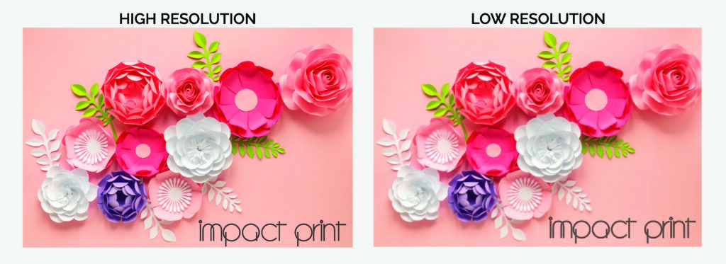
High Resolution
When you’re gearing up to print for business purposes, the goal is clear: you want those prints to command attention with their sharpness, vibrancy, and sheer visual allure. This is where the magic of high-resolution images takes center stage, transforming your printing game from ordinary to extraordinary. Let’s dive into the technical wizardry a bit – resolution, which essentially signifies the number of pixels per inch (PPI) or dots per inch (DPI) in your artwork, is the secret sauce behind this transformative process.
For that top-tier, premium quality business printing that leaves a lasting impression, it’s the golden rule to aim for a resolution of at least 300 PPI/DPI. Picture this as the fine brushstrokes of a master painter – each pixel and dot intricately placed to preserve even the most minuscule intricacies within your artwork. With this heightened resolution in your corner, the outcome is nothing short of magical: your prints emerge as flag bearers of professionalism, clarity, and vitality.
No more settling for the ordinary – it’s time to unleash the extraordinary. Embrace the power of high-resolution images, for they hold the key to elevating your prints from mere paper to a realm where every detail, every hue, and every stroke is faithfully captured. The result? Prints that don’t just stand out, but boldly announce their presence, ready to captivate and inspire your clients or customers. Remember, in the realm of business printing, high resolution isn’t just a choice; it’s the conduit through which your vision transforms into an awe-inspiring reality.
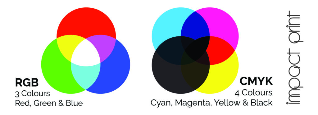
Colour Modes
Navigating the realm of color in the realm of printing can sometimes feel like treading on uncertain terrain, but worry not – we’re your trusty guides through this chromatic journey. You might have come across the terms RGB (Red, Green, and Blue) and CMYK (Cyan, Magenta, Yellow, and Black), each carrying its own role in the colorful universe. RGB reigns supreme on digital screens, like the dazzling display of your computer or the vivid hues of your smartphone. Now, enter CMYK – the unsung hero of printing, seamlessly orchestrating the symphony of colors on paper.
Picture it as a translation process: your artwork’s vivid digital palette needs a bit of transformation to ensure it shines just as brightly on paper. This is where the magical conversion to CMYK comes in. Think of it as a chameleon donning a new coat to fit in – your colors undergo a shift to align with the printing world’s language. Why is this step so pivotal? Well, it’s akin to ensuring that the outfit you meticulously chose in the morning looks just as stunning under different lighting conditions.
The result? When your artwork is gracefully converted to CMYK, you’re ensuring a harmonious rendezvous between screen and paper. What you see on your screen is what you’ll get on your prints, without any unwelcome surprises crashing the party. But here’s the kicker: you don’t need to worry about the technical intricacies. That’s our domain. Our experts are at the helm, handling the transformation like color wizards, so you can kick back, relax, and let the anticipation brew. The outcome? Prints that exude a kaleidoscope of vibrancy, beckoning attention and capturing hearts with colors that leap off the page, exactly as you envisioned.
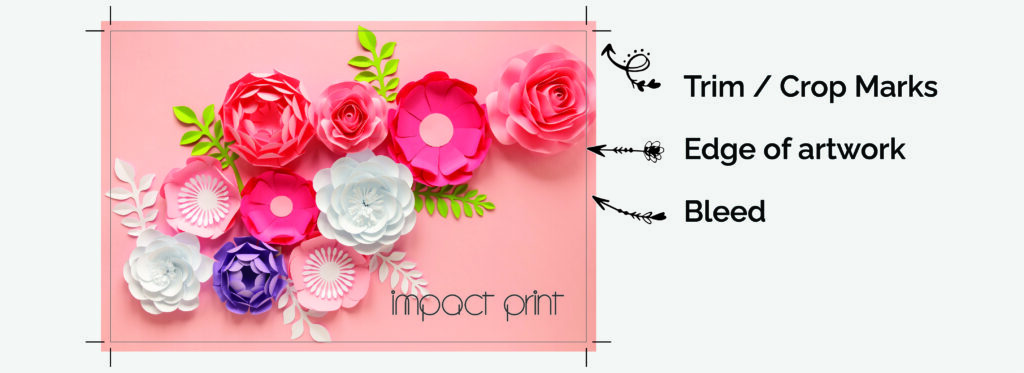
Bleed and Trim Guidelines
We understand that achieving a truly professional look for your prints is a top priority, and we’ve got just the solution to eliminate any worries about awkward white borders or uneven edges. This is where the valuable concepts of bleed and trim guidelines come into play, ensuring that your prints exude a level of sophistication that leaves no room for imperfections.
When we talk about “bleed,” think of it as your design’s safety cushion. It involves extending your artwork slightly beyond the actual printing area – typically limited to just the background color. This strategic extension serves as a safeguard against any minor shifts that might occur during the trimming process. Imagine you’re creating a work of art that you want to showcase on a canvas – by extending your design a tad beyond the canvas edges, you’re making sure that even if the canvas is trimmed slightly off, your masterpiece remains whole, right to the very edges.
In other words, bleed is your secret weapon against those pesky white gaps that can otherwise sneak in unexpectedly. We’ve found that a 3mm bleed provides the ideal coverage, ensuring that your design seamlessly integrates with the paper, leaving no space for unwanted white borders.
Why does all this matter? Because when you apply this bleed technique and adhere to the trim guidelines, your prints emerge with a sleek, polished appearance that’s primed to capture attention and admiration. Whether you’re presenting to clients or creating marketing collaterol, these meticulously crafted prints demonstrate your commitment to excellence, attention to detail, and an uncompromising pursuit of perfection. So rest assured, with our recommended 3mm bleed, your prints will make a lasting impression, reflecting your dedication to quality and leaving a trail of awe in their wake.
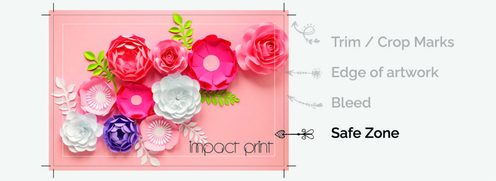
Safe Zone
Our utmost concern is to safeguard every bit of essential information throughout the intricate stages of printing and trimming. To achieve this, we introduce you to the concept of the safety zone – a designated haven within your artwork where crucial elements like text, logos, and indispensable design components find their home. It’s like a protective barrier ensuring these vital parts stay shielded from any potential snips or trims.
Picture it this way: the safety zone is your art’s insurance policy. We’re here to recommend that you maintain a comfortable distance of at least 3mm from the edge of your artwork. By doing so, you’re creating a buffer that guarantees your significant content not only remains intact but also stands out in its full glory. Think of it as a specially reserved VIP area within your canvas, where every piece of your design’s puzzle finds its perfect fit.
The result? A harmonious dance between aesthetics and functionality, where your masterpiece not only speaks volumes but also maintains its visual allure. We understand the importance of your message and the significance of your branding. So, by adhering to this simple yet vital precaution, you’re ensuring that your prints are a true reflection of your intent – polished, unblemished, and leaving a lasting imprint on those who lay their eyes upon them.
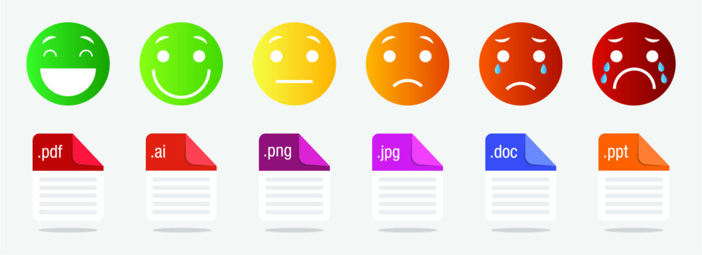
File Formats Made Easy
Saving your files in the right formats is essential to ensuring smooth printing and great results. We recommend using the PDF (Portable Document Format) file format because it’s widely compatible and keeps the quality of your artwork sharp. PDFs make sure that your fonts, images, and formatting stay just the way you want them, regardless of the software used for printing. Also, embedding all fonts or converting text to outlines takes care of any font-related issues that could pop up during printing. We can guide you through the process over the phone if you need it, making it hassle-free, so you can sit back and relax, knowing that your prints will come out looking amazing.
Some examples of suitable software for creating artwork are:
- Adobe Illustrator or Photoshop
- CorelDraw
- Canva (make sure you select PDF Print to download and tick the boxes for cropmarks and bleed as well as flatten PDF).
- Inkscape (completely free)
However, there are plenty more apps and programs out there that would work. If you are unsure, pop us a mail or give us a call, and we would be happy to share our knowledge or help you find a solution that works for you!
Summary
The road to getting your artwork print-ready for the big leagues of professional printing doesn’t need to be a nerve-wracking expedition, even if you’re not exactly an art savant. Rest assured, we’ve got your back with a user-friendly guide that makes this process feel like a breeze. Embrace this journey armed with our straightforward instructions, and you’ll find yourself confidently paving the way for impeccable prints that are ready to take center stage.
Think of it as an artful checklist: resolution, color modes, bleed and trim guidelines, safety zones, and file formats – these are the puzzle pieces that come together to create a masterpiece of print readiness. It’s like getting your ingredients prepped before baking a cake – each element has a crucial role in ensuring the final result is nothing short of a delectable treat for the eyes.
The quick checklist:
- Resolution – the cornerstone of sharpness. Use 300 ppi/dpi
- Color modes – the wizards that translate hues between screens and paper. Use CMYK
- Bleed and trim guidelines – the secret agents warding off awkward edges. 3 mm please!
- Safety zones – the invisible fences that protect your vital elements and. 5 mm for a professional look
- File formats – the digital codes that carry your artistic essence. Save your file as a high resolution PDF
Thanks for reading! If you have any questions, pop us a comment below or an email. Our skilled team, a squad of printing virtuosos, is on standby, ever ready to lend their expertise tailored to your unique needs. They’re like the mentors cheering you on during an art class, making sure your strokes hit the canvas with precision.
What is the purpose of incorporating a 3mm bleed in your design, and how does it contribute to the final print quality? Greeting : Teknik Telekomunikasi
Great question! Even with high-precision industrial cutters, there can be slight movements—fractions of a millimeter—when the paper is being trimmed to its final size. If your design stops exactly at the edge of the page and the blade is off by even a hair, you’ll end up with a thin, distracting white line along the edge of your work.